Mini Art School Part II (A)
3. Compare the home pages of two online news organizations. What techniques communicate visual hierarchy? Does either employ modular page design? How do you know?
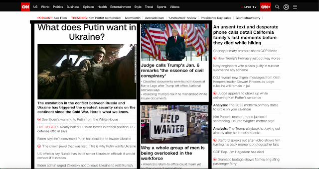
CNN- The CNN homepage grasps the readers attention immediately by having the main headline in bold and bigger font then all the other sub headlines. Their website does use a modular page design in having stories orange in square and rectangular designs. The main headline is designed in a larger rectangle while supporting headlines are more square. The top story is based on the left side of the page and has many supporting links and articles under it while the the stories towards the middle only have two or three.


Your comments on how these pages show hierarchy are really interesting. The way that ABC attempts to stand out through a lack of bold attention-grabbers really shows how these two news sites make sure they don't look too similar.
ReplyDelete