Posts

Mini Art School Part 3 (B)

Image
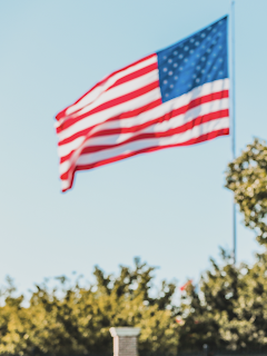
 Cropping Exercise                         (Cropped)                                                (Original) I cropped the original photo from a horizontal alignment to more of a vertical alignment to allow more emphasis and focus of the American Flag.  (Cropped) (Original) I cropped the original photo into a horizontal alignment to focus on the “Rutgers Football” sign. The cropped phot would be suitable for a website header.  (Original) (Cropped) This was an aggressive crop in order to focus on the block “R”. 

Mini Art School Part 3 (A)

Image
Border Variation  These are 6 borders/frames that I used for this photo. I felt as thought these borders were the ones that helped make this photo more eye catching.   

Mini Art School Part II (B)

Image
 Adidas Logo Redesign  (Original) (Redesign) Adidas uses the "ITC Avant Garde" font for their logo. The stripes on their logo represent the variety of the company. They aim towards promoting a lifestyle brand. However, I see Adidas as a sports brand so I redesigned the logo for the stripes to be vertical and represent a medal finish. Meaning then first stripe represent "1st Place," and the second stripe would be second and third would be third. I feel as though that gives it a more competitive feel to the brand. I also made the first stripe gold because that represent the color of a first place medal. 

Mini Art School Part II (A)

Image
  3. Compare the home pages of two online news organizations. What techniques communicate visual hierarchy? Does either employ modular page design? How do you know? CNN- The CNN homepage grasps the readers attention immediately by having the main headline in bold and bigger font then all the other sub headlines. Their website does use a modular page design in having stories orange in square and rectangular designs. The main headline is designed in a larger rectangle while supporting headlines are more square. The top story is based on the left side of the page and has many supporting links and articles under it while the the stories towards the middle only have two or three.   ABC- ABC news uses a modular design as well. However, their visual hierarchy is in the center of the screen. Unlike CNN who's top headline was to the left. ABC also only has one major headline. They make the headline visible by having it in a bigger size font and bold as well. They also add an image that corr

Mini Art School Part 1 (C)

Image
 1. The poster grasps its audience attention immediately. The message is made clear by having "tryouts" in all caps. Uses hierarchy well.  2. The poster uses a bright gradient color that makes the design stand out. Really grabs that readers attention with such a bright color.  3. The font stayed consistent throughout the poster. Used more of a paint spray style font on the the word "tryout" which I liked because it is the main message in this design.  4. The poster is very detailed. The reader should be able to get all the information needed as it is made extremely clear and concise.  5. The text color and background colors are different.  6. The image of the player is not centered, therefore it is not in the way of content and not the center focus.  7. One thins this poster could've done better is having a bit more white space. The only white space that was present was on the top right corner.  8. I felt like this design used the rule of thirds effectively. The

Mini Art School Part 1 (B)

Image
Design Basic Index: Loosened Alignment Exercise   

Mini Art School Part 1 (A)

Image
 Design Basic Index: Decisive Presentation Exercise